文字懸停
參考自 https://blog.csdn.net/qq449245884/article/details/105326186
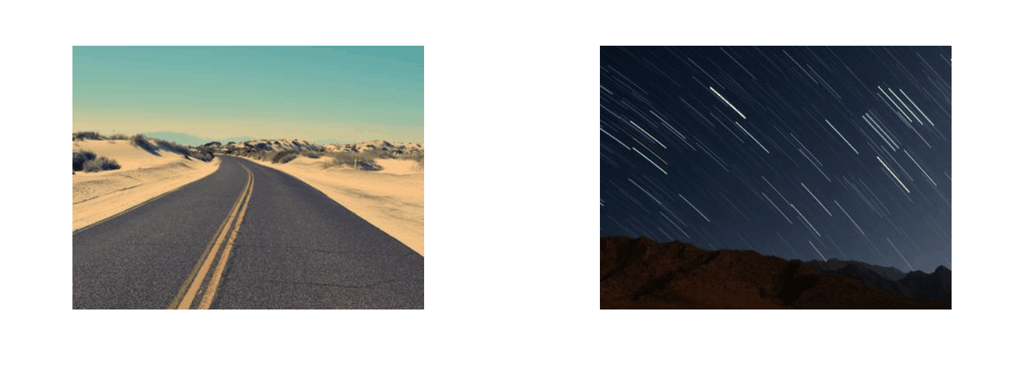
效果
代碼
HTML
1 |
|
CSS
1 | body { |
CSS講解
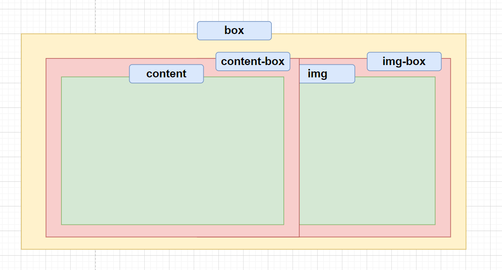
示意圖
透過在box定義相對定位,並在content-box以及img-box設定絕對定位來讓它們重和
重要代碼塊
當hover到box時要讓content-box營造從左到右出現並在消失是從右邊收合
1
2
3
4
5
6
7
8
9
10
11
12
13
.content-box {
transition: transform 0.5s;
/*將元素以開窗戶的方式顯現(如果沒有設定origin的話)*/
transform: scaleX(0);
/*消失是在右邊*/
transform-origin: right;
}
.box:hover .content-box {
/*將元素以開窗戶的方式顯現(如果沒有設定origin的話)*/
transform: scaleX(1);
/*消失是在左邊*/
transform-origin: left;
}當hover到的時候再讓文字塊顯現(使用opacity)
1
2
3
4
5
6
7
8
9設置延遲時間,讓用戶產生打開才顯現的感覺.content-box .content {
opacity: 0;
}
.box:hover .content-box .content{
opacity: 1;
/*設置延遲時間,讓用戶產生打開才顯現的感覺*/
transition: all 0.5s 0.3s;
}